| << return to blog entries
2010-08-25 01:53:38 (6683 views) 
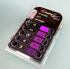
Doing it professionally this time, and no room for errors. Slight redesign as the old color scheme for the remote was a bit "funerary".
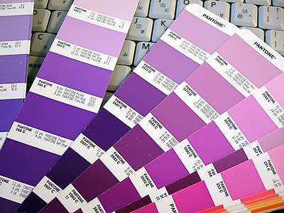
Here's the photoshopped preview. But your monitor can't capture the whole gamut of printable colors so it will look slightly different. And, we've worked on the old overlay - the new one should look thicker and more professional.
By the way, many printed colors are a lot more beautiful than their electronic counterparts!

Comments
Post new comment
 |


My designer slave would be impressed with your selection. ;-)