|
2010-08-22 23:43:03 (5450 views) Tried the glow in the dark parts under a real fluorescent UV light (not an LED source, which has a lot more emissions in the visible spectrum).
With a 20W lamp the rubber fully charges when you stand less than 2 meters from the source. At greater distances the pigment still charges, but not to full intensity.
That said full intensity is really a lot brighter than you'd expect; the two small yellow grommets get bright enough to be able to read a book with no other light source. A 5x5 inch square of pigment is like a tiny lamp when fully charged.
At 1 meter distance, ...

2010-08-17 10:12:12 (8358 views) Just a quick update on the current status and ETA.
- LEGAL: The company was formed and the bank account created. This is a big deal! The first Male Management company owns the financial and juridic structure necessary to bring our dreams to reality. We are now able to accept funds by wire transfer and we are trying to apply for card processing.
- PLASTIC: The mold was created and revised, we should get new parts this week to test all dimensions are perfect, then send it off for polishing. With some luck early next week we can start producing perfect parts that will go into the final product; actual production will not take a week. This is also a big deal, we've gone from messing around with square black boxes to having a miniaturized waterproof custom enclosure that attaches to CB devices comfortably.
- RUBBER: We've tested the glow in the dark pigments, everything works as planned, whether we choose these glowing colors or not rubber part production should start concurrently with the plastic and take no longer than 1 week.
- AROUSAL INDUCERS: Overmolded motor production will happen concurrently with the plastic and rubber. Won't take more than 1 week to have enough motors to start selling. This was one of the hardest technical challenges, although it didn't really slow us down much because we were waiting for the company to be created. Still, the engineering challenges were formidable.
- OVERLAYS: Well, you've read the story, they basically cheated us and made a cheap sticker instead of a real 0.5mm plastic overlay. We're talking with 3 new suppliers, one turned us down, one is playing games, one seems to be all right. These things can be created in a week or so, so they will be ready by the time everything else is ready
- EMC TESTING: Was scheduled for Tuesday but the lab ran out of a specific part we need, we're rescheduling and should be done with it by early next week. If we pass all tests we're officially authorized to sell in the US, and in the EU shortly thereafter once we do a bit more paperwork. This is the biggest waste of time/money and the largest pain in the rear, but it's necessary.
- PCBs and assembly: As soon as we pass EMC testing we'll do a component count, place an order for the needed lots and sync with the PCB assembly guys. If they don't flake (long time since we contacted them) and if they aren't super busy they may be able to put together boards for us within 2 weeks of EMC testing. If this turns out to be one of those 1 or 2 month delay things we'll just hand assemble boards until automated assembly is in place so fear not.
There are still a few issues with everything (programming, LEDs, issues with the keypad, custom screws quality), but they can be solved as we go along.
At this point it looks like none of the milestones are beyond the 30 day mark, except, possibly, fulfillment (we need to transport the stuff to our US fulfillment house, all materials must go through customs).
We are slowly but surely coming to the end of a long and fantastically complex development phase...

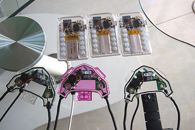
2010-08-17 09:15:41 (7519 views) Plastic hues, spray paint colors, rubber parts and glow in the dark pigments. You've seen pictures of almost all combinations. Now it's time to make a decision.
We think:
- remote: clear looks best with the overlay. May partially spray paint the bottom to hide the ugly PCB's behind but not over the edges which would stay transparent.
- receiver: clear, or spray paint black or white or silver leaving the LED hole clear. Black looks mean, white looks clean, silver looks futuristic, clear is nice because of many reasons though in our opinion it makes the product look less "finished".
- rubber: depends on the receiver. The glow in the dark colors don't make that much difference in a regular setting. Therefore it seems we should go with black and offer the glowing colors as a separate product if people really want them.
This is "interactive product development"... we're curious to hear what you think about the new colors and the different combinations.

2010-08-17 09:01:13 (5693 views) The pigments are generally very hard to charge without sunlight except for yellow-green and to a lesser extent aqua.
Expect the glow in the dark effect to only be useful for playing, or in a club situation where fluorescent UV blacklights will charge the pigments and give the effect you've seen in the pictures.
Some have inquired about using the DL2000 for video projects; placing a blacklight somewhere will allow nice footage if these glow in the dark colors are used.
SUNLIGHT TEST:
5 seconds are enough to charge pigments to their full brightness; however to get maximum shine time 20 seconds are required. Move to a pretty dark room and be amazed. All pictures posted previously were NOT photoshopped and are as close as possible to what the eye sees.
ARTIFICIAL LIGHT TEST:
Only yellow-green and aqua can be recharged well with artificial lights. The bulb must be kept not more than 20-30 cm from the rubber in order to charge well. This depends obviously on the strength of the light source. 20 seconds are needed for full glow. Shine time tests were not carried out. When the rubber parts are allowed to charge from ambient light or ceiling lights they never achieve their full brightness and you need pretty much total darkness to see them glow more than a bit - except for the yellow-green color which is pretty standard but has the best recharging and glow time figures. Add to that the fact that the receiver is mounted vertically, so even if you go around the house naked, chances are your glow in the dark parts will NOT charge very well by just being exposed to ceiling lights over 1.5 meters away.
UV LED TEST:
Finally got a real UV LED (not purple). UV light charges the rubber optimally; strength is hard to define because who knows how strong those fluorescent club UV lights really are, and how strong an LED is in proportion. Expect very nice results when UV lights are present. And for events with no UV lights, you can just bring a UV LED and two CR2032 batteries (round type) giving 6V, and charge up your device's glow whenever needed.
One note: UV LEDs emit lots of purple, and even blue. So fluorescent UV blacklights are a lot better suited for playing with colors. They have little light in the visible spectrum, so the glow from the pigments stands out even more.
CONCLUSIONS:
Better than we expected, spectacular under the right conditions, not really a big deal for normal wear, and not very expensive to create compared with other color rubber. Slightly less good looking in regular light (rubber is whitish rather than black) but that's a matter of taste.
The choice is between "whitish" daytime rubber parts with wonderful neon colors with UV light or after charging, OR, regular black rubber.

2010-08-17 02:26:52 (5277 views) Exhausting preparations for EMC testing. This was postponed from Tuesday due to the fact that the lab ran out of ferrite beads of the right size. We've got these ferrite pieces now and three complete sets ready for testing. We're waiting for the lab to reschedule us - we probably will end up going this week or early next week.

2010-08-16 01:50:07 (5620 views) STAGE 1
First of all, let's admire these beautiful parts.
Just charged in the sun and taken to a dark room:
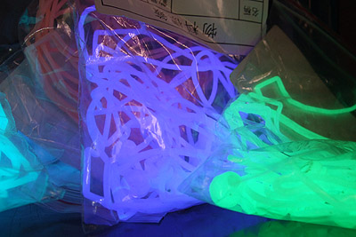
Another shot:
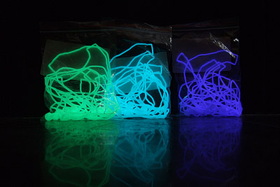
This is an adjusted version, more representative of the actual brightness the eye sees. It won't help much if your monitor is much brighter or darker than ours...
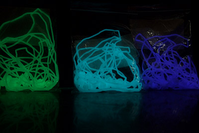
Some details...
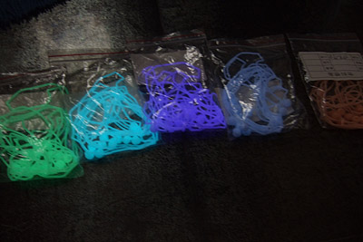
This is what the pigments look like, notice that the two colors on the right don't seem to shine at all and that's because the room wasn't perfectly dark. From left to right: Yellow-Green, Blue-Green (aqua), Purple, Blue, Orange-Red. Blue and Red are the two weakest glowing colors, although red is a color rarely seen in phosphorescent products and it's really neat when you are in total darkness and it's just charged.
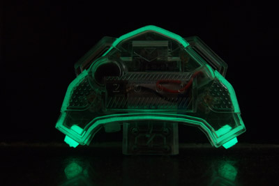
Now, you all know the yellow-green color, this is what's been used for the past decade in all manner of toys and emergency signs. However there was a breakthrough a few years ago when a better compound was discovered that glows much brighter and for a longer time. So if you've played with some glow in the dark toy a while ago you may be surprised. When this pigment is fully charged and taken to a dark room it glows as strong as those glow sticks. The benefit of using this color is that it's the brightest and fastest charging (and longest lasting). However it's not so sexy just because it's been overused.
Blue-green (aqua) is just a notch less bright and long lasting than yellow-green, but it's not something you see often, and so we prefer it.
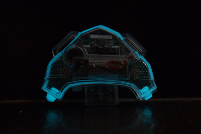
Here's the back view.
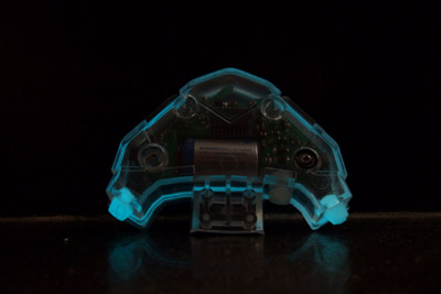
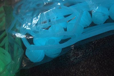
Blue color isn't that far from aqua, but it has very poor performance; it's not nearly as bright and the glow fades very quickly. This is not a winner.
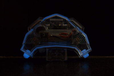
Purple is very hard to capture; this is the original shot:
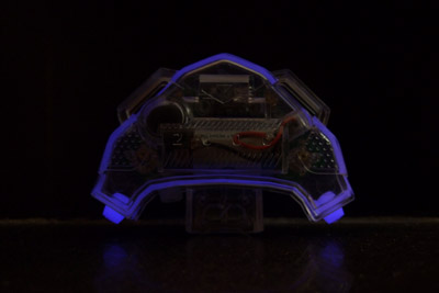
And this is a color adjusted version that looks closer to what the naked eye sees.
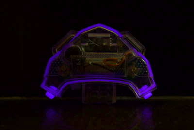
Purple is really awesome, it's a color that is at the far end of the visible spectrum and can't be reproduced very well by your monitor. This pigment looks a lot like the UV lights in a disco. It charges in the sun just fine, however we've had trouble charging it with household lights. We'll try again tonight and post results. All these pigments have very different properties deriving from the quantum-mechanical ways in which photons are stored and reemitted so sometimes they respond well to a narrow range of wavelengths. Sunlight has them all so it's no problem. UV lights should work just fine. Regular lighting... for purple it depends a lot! For aqua and yellow any light is ok. Our theory: the pigments need a charging wavelength that has higher energy than the photons reemitted. So yellow takes anything, but purple needs UV... ?
Now red (orange-red, really, but more red than orange) is hard to explain. This color is totally cool, but it's only bright enough to appreciate in all its beauty for half a minute or so, and you need real darkness to see it - not quite total darkness, but if you've got any sunlight at all coming in it won't look like it's glowing at all.
This is a shot taken after about a minute of charging. The room wasn't perfectly dark.
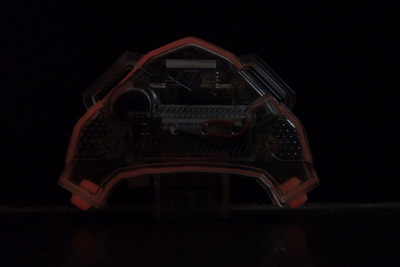
This is an adjusted version, showing what the eye really sees (actually not exactly, there's a very low wavelength red component here that the camera doesn't capture, these unusual wavelengths (deep red and deep purple), which the monitor doesn't reproduce, are the ones that look coolest because the eye isn't exposed to their hues very often).
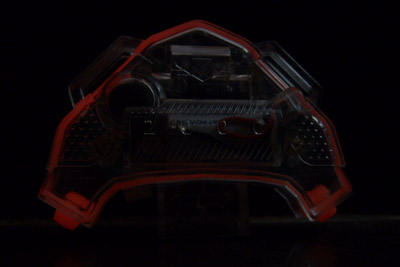
Please note that if we wanted to make this look cool in the photos we could have taken the pictures 1 second after charging and they would all look like neon lights. However the purpose here is to achieve some degree of realism...
Here is a brightness comparison. Red vs Purple after 20 seconds of charging, room not perfectly dark.
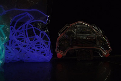
So what's the winner? We like aqua a lot because it glows with some strength and it's not the usual yellow-green. Both yellow green and blue green (Aqua) glow strong enough that the little grommet illuminates surfaces it rests on. Purple does that to some extent too but for a shorter time.
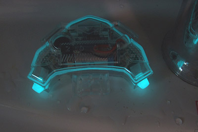
Of course if you happen to be in a club this thing should just glow like crazy because UV is what it likes to eat for breakfast... But we haven't tried a bright UV light from a reasonable distance because... we don't have one. Instead, this is what a tiny purple led does when it's pushed right into the grommet. The light from this LED is not bright at all because it emits only purple and some UV. All the glow you see is from reemitted energy.
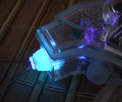
If the enclosure is to be clear, the war is on between purple and aqua. We need to test at night, and with different lights especially a real UV light. It's hard to monitor glow decay during the day because the parts look like they're dead very quickly but they aren't really.
The final consideration is the color these parts have in normal lighting (when you can't see them glowing at all).
Purple is pure white in normal lighting, which makes it the best looking. All other colors look off-white (slightly yellowish), except for blue which is almost pure white (but doesn't glow much at all) and red (which looks pale orange).
STAGE 2
We tried the pink transparent enclosure with the purple silicone parts:
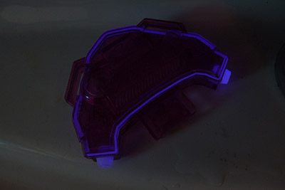
Not much difference in the glow color.
Then we remembered that we have some spray painted enclosures on hand.
Black looks mean:
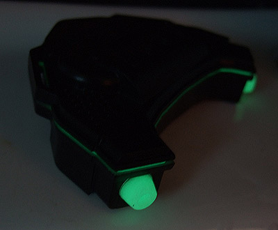
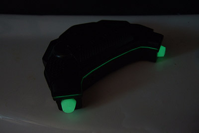
White looks very futuristic with purple:
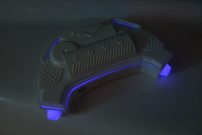
And even better with aqua:
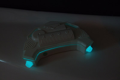
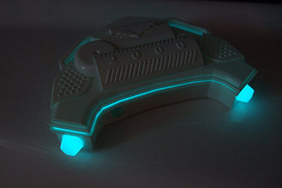
But as far as futurism goes the winner here is clearly the silver spray painted enclosure with purple glow in the dark silicone:
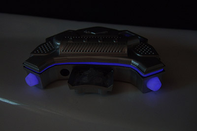
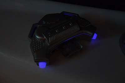
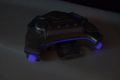
*This* is something that an advanced civilization would pass down to help train Earth males!
Stage 2 pictures were taken under favorable lighting conditions (light enough to see the enclosure color, dark enough to see the pigments). They show glow levels very soon (seconds) after charging in sunlight for a few seconds (on a not particularly bright day).
Opinions welcome!
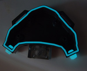
Oh, last one: Tron style...
 |


